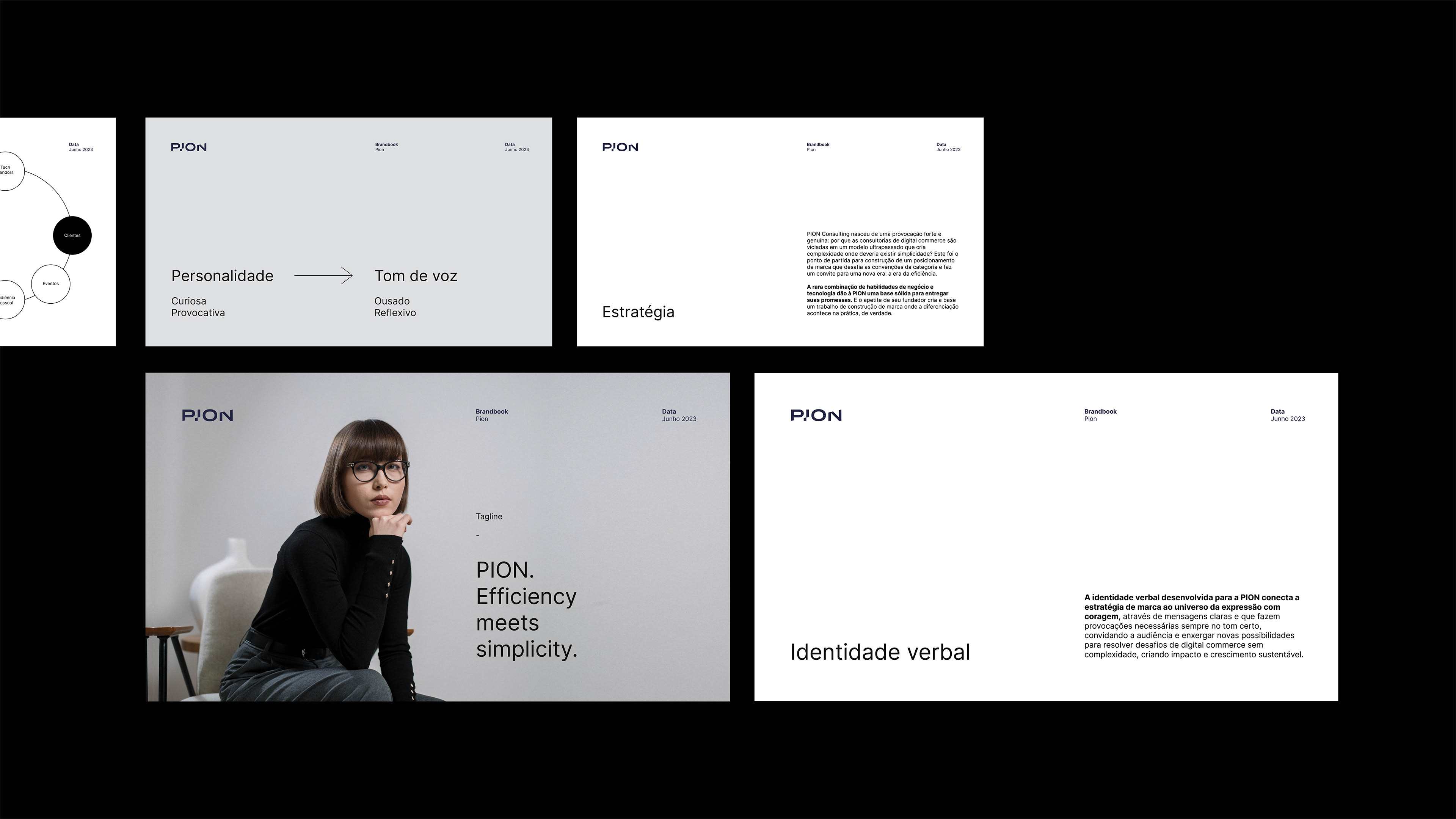
PION. Efficiency meets simplicity.
Estratégia / Strategy
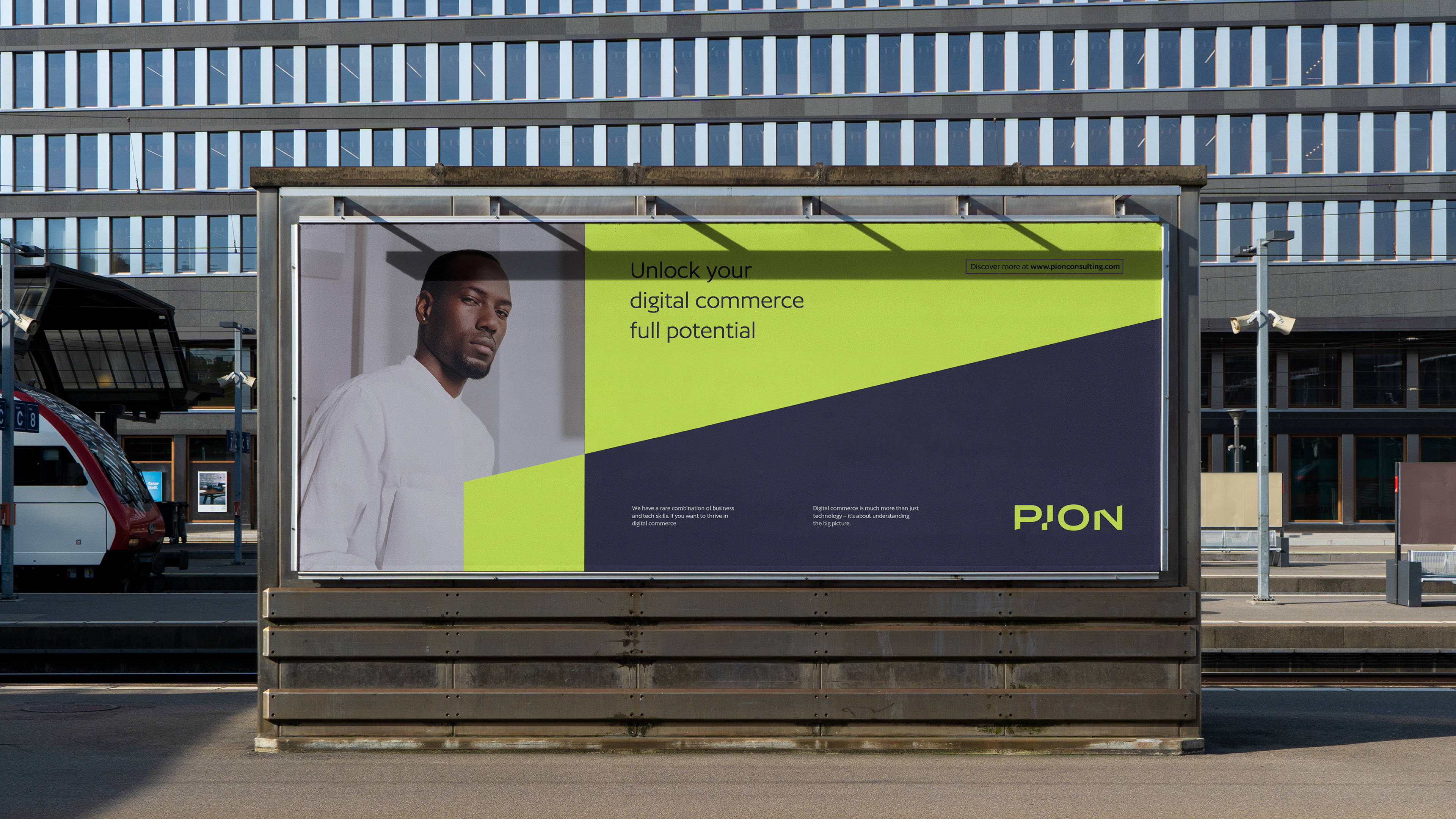
PION Consulting nasceu de uma provocação forte e genuína: por que as consultorias de digital commerce são viciadas em um modelo ultrapassado que cria complexidade onde deveria existir simplicidade? Este foi o ponto de partida para construção de um posicionamento de marca que desafia as convenções da categoria e faz um convite para uma nova era: a era da eficiência. A rara combinação de habilidades de negócio e tecnologia dão à PION uma base sólida para entregar suas promessas. E o apetite de seu fundador cria a base um trabalho de construção de marca onde a diferenciação acontece na prática, de verdade.
PION Consulting was born from a strong and genuine provocation: why are digital commerce consultancies addicted to an outdated model that creates complexity where simplicity should exist? This was the starting point for building a brand positioning that challenges the conventions of the category and invites us to a new era: the era of efficiency. The rare combination of business and technology skills gives PION a solid foundation to deliver on its promises. And its founder's appetite creates the basis for brand building work where differentiation happens in practice, for real.

Identidade Visual / Visual Identity
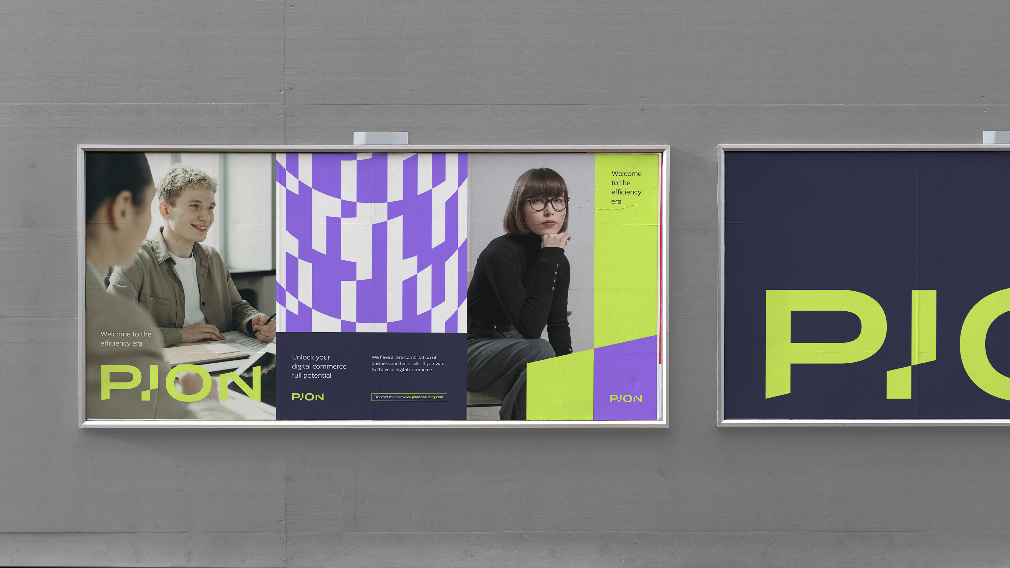
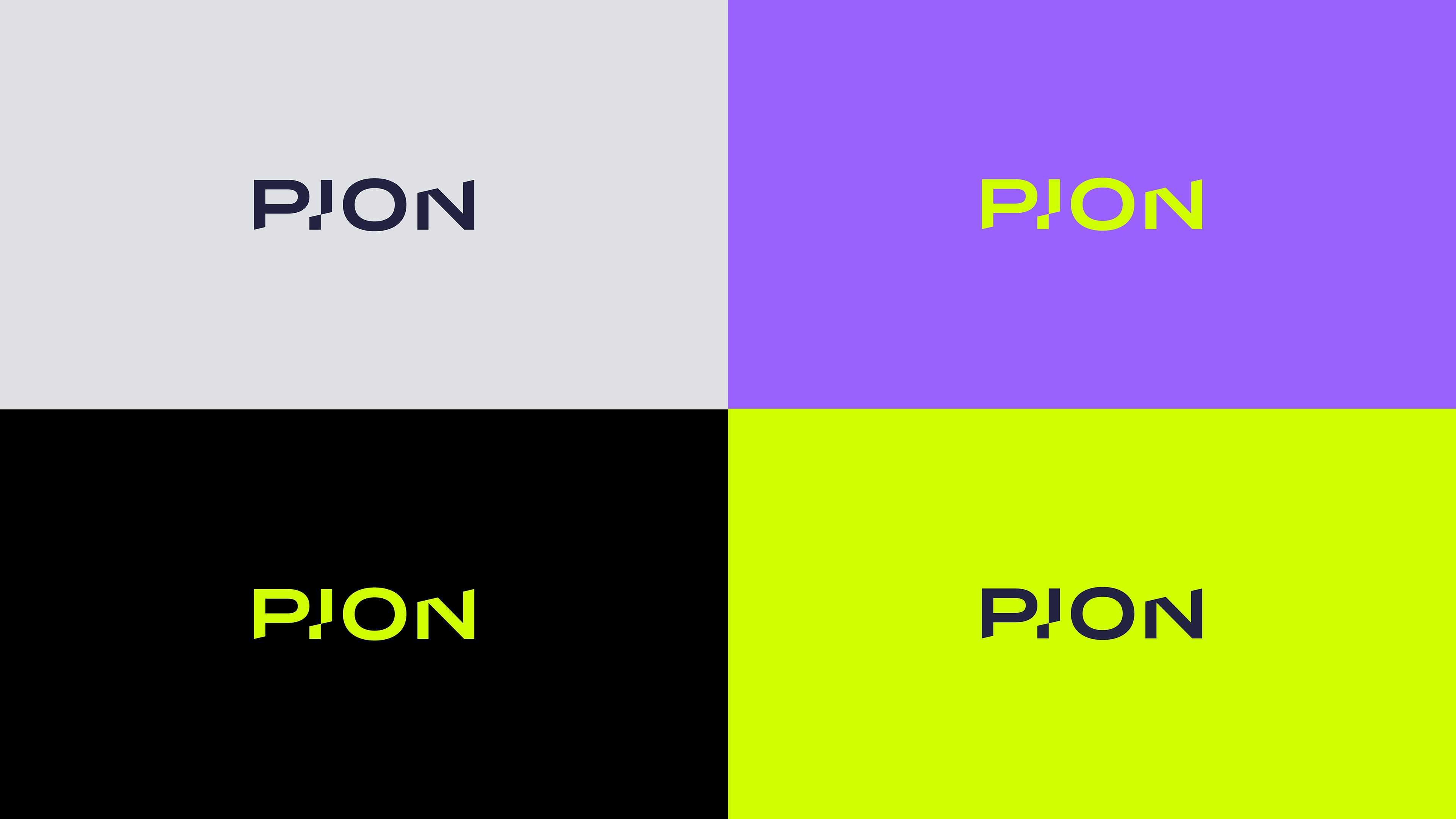
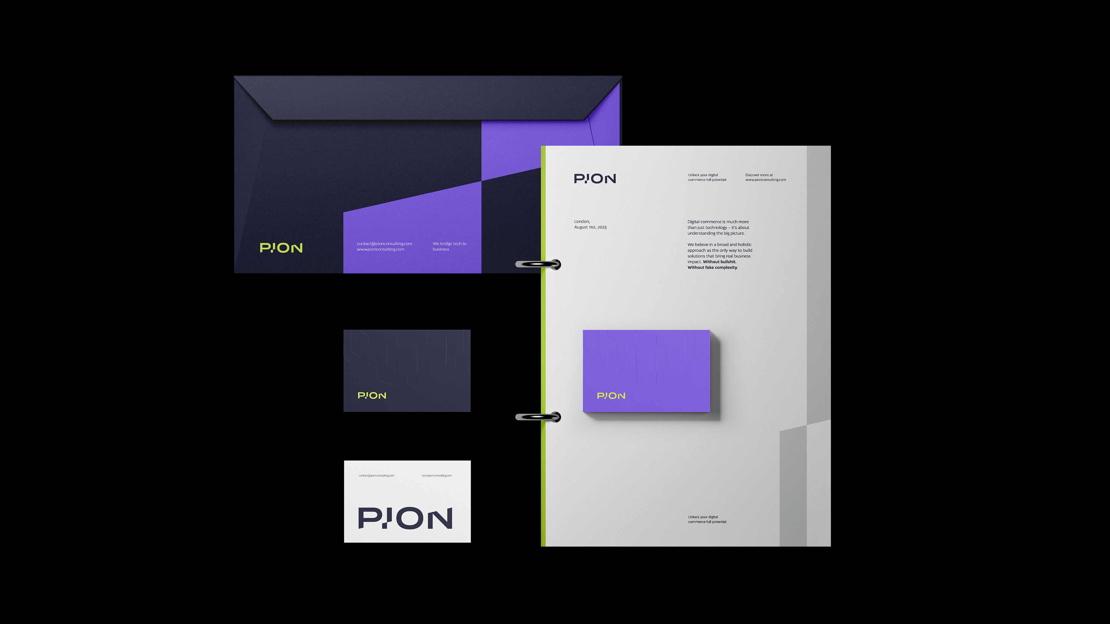
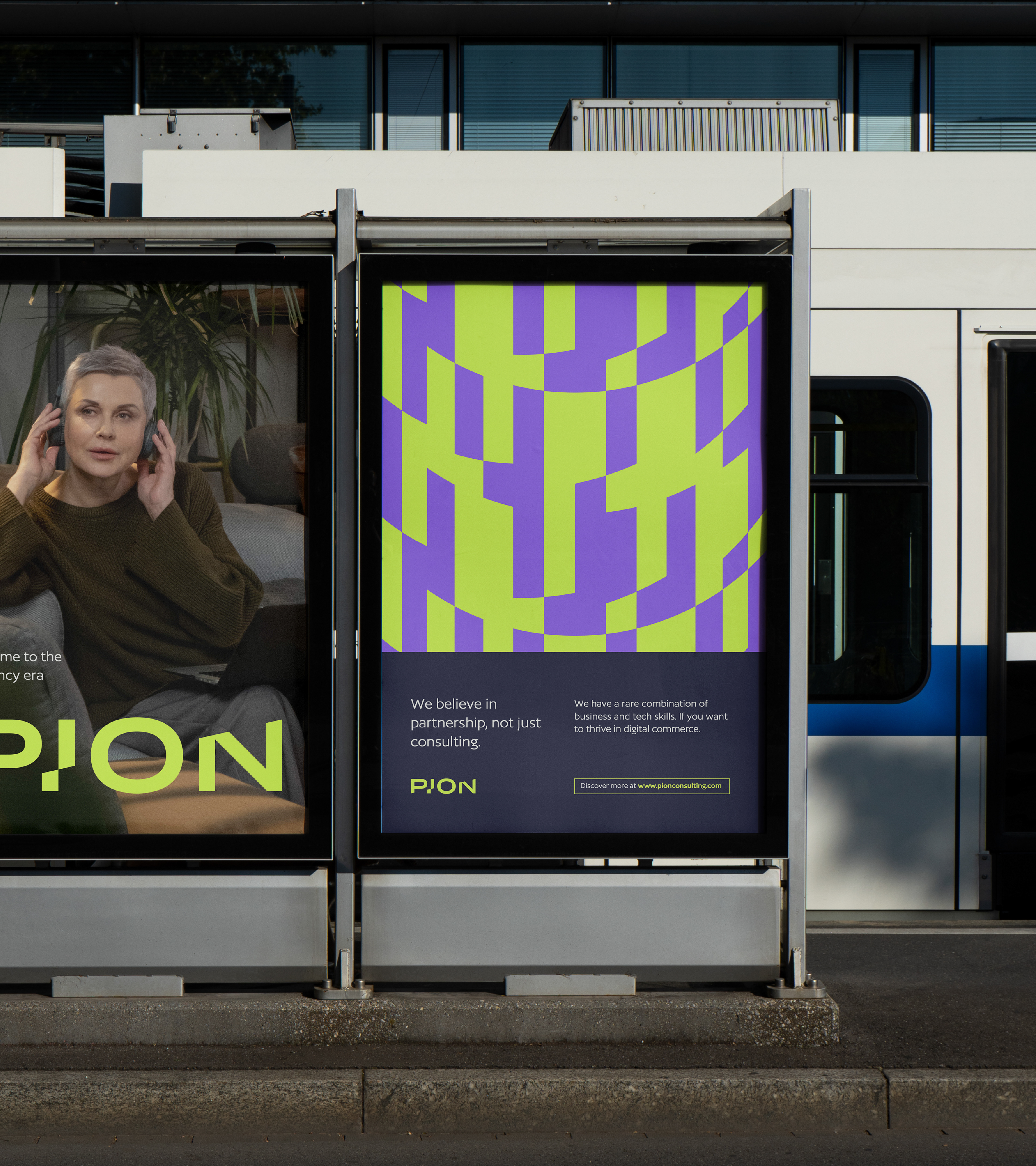
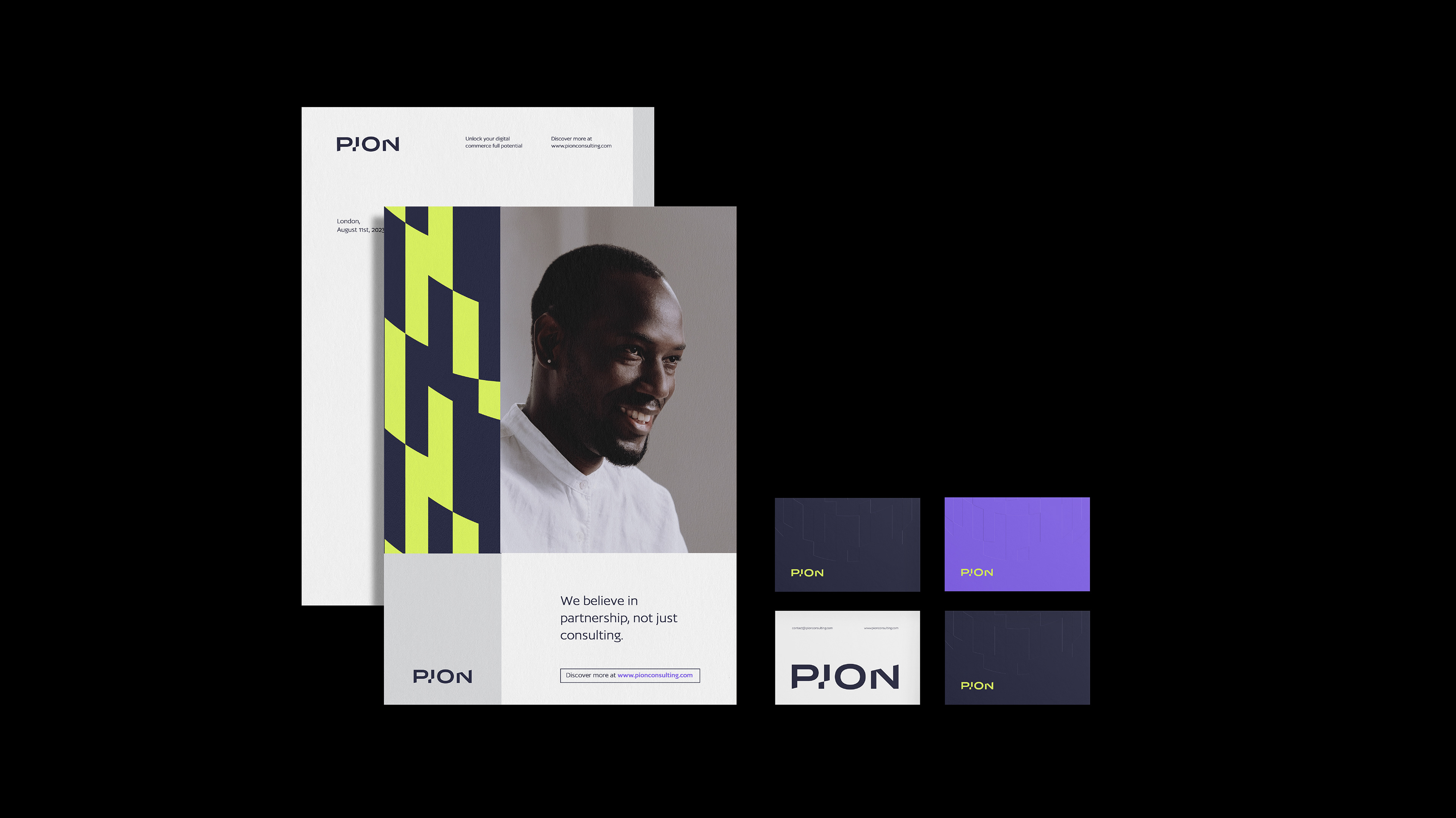
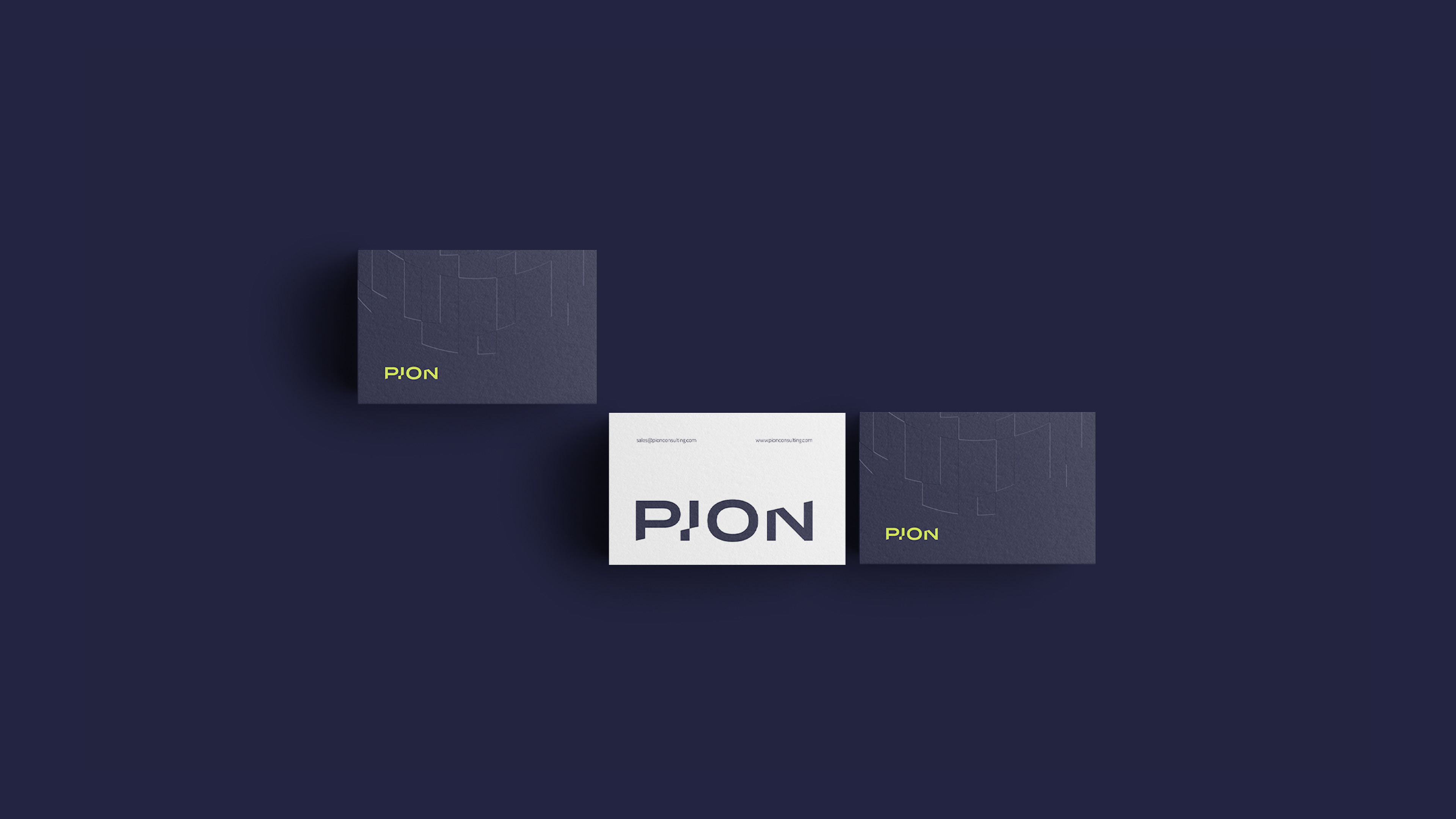
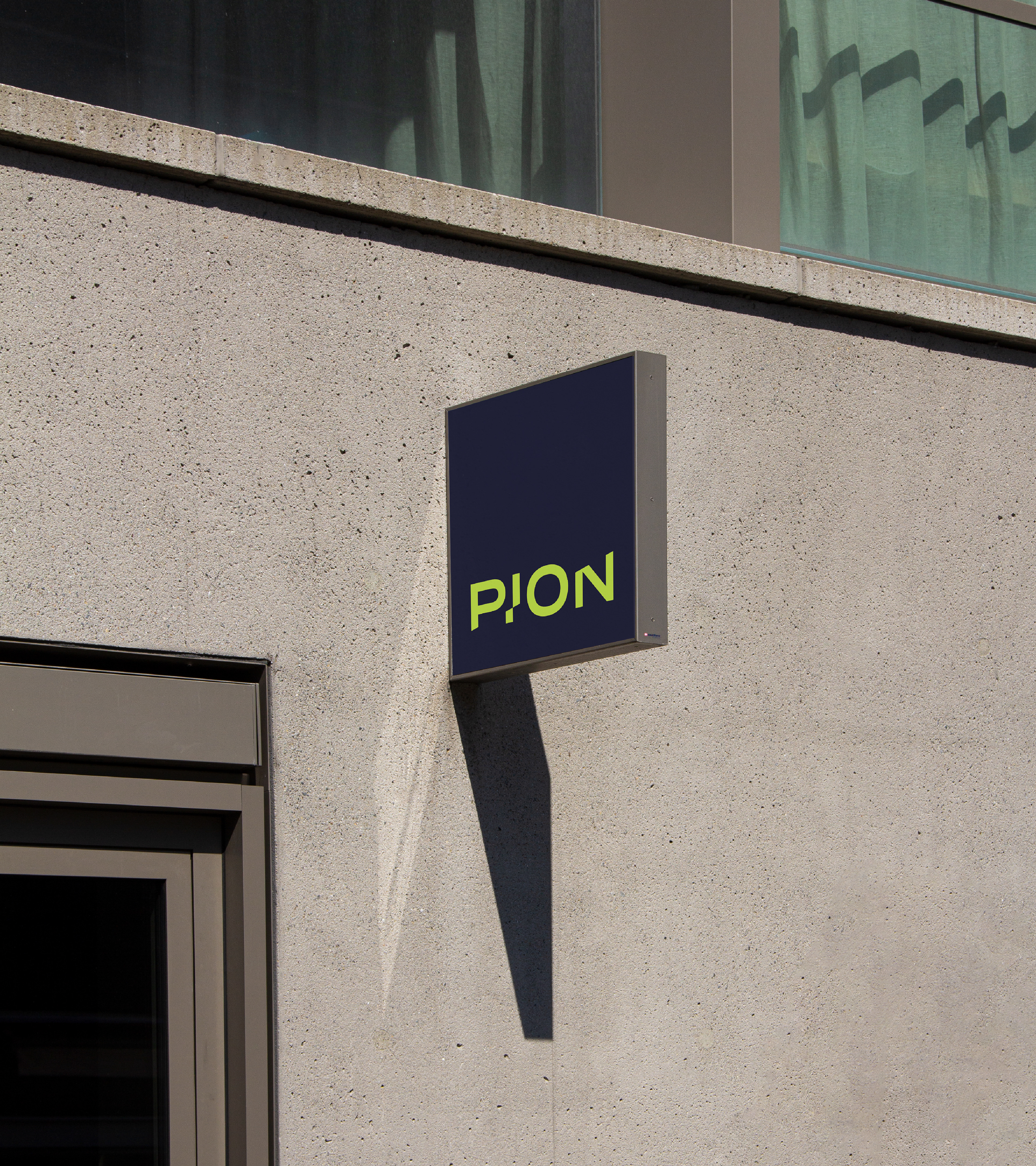
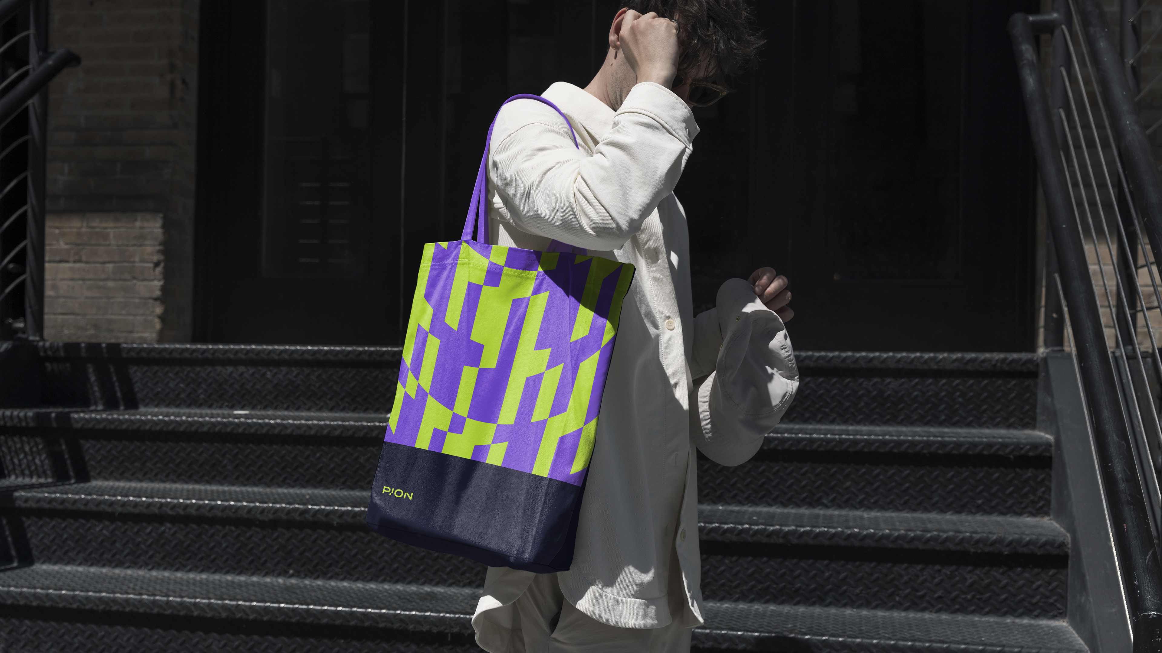
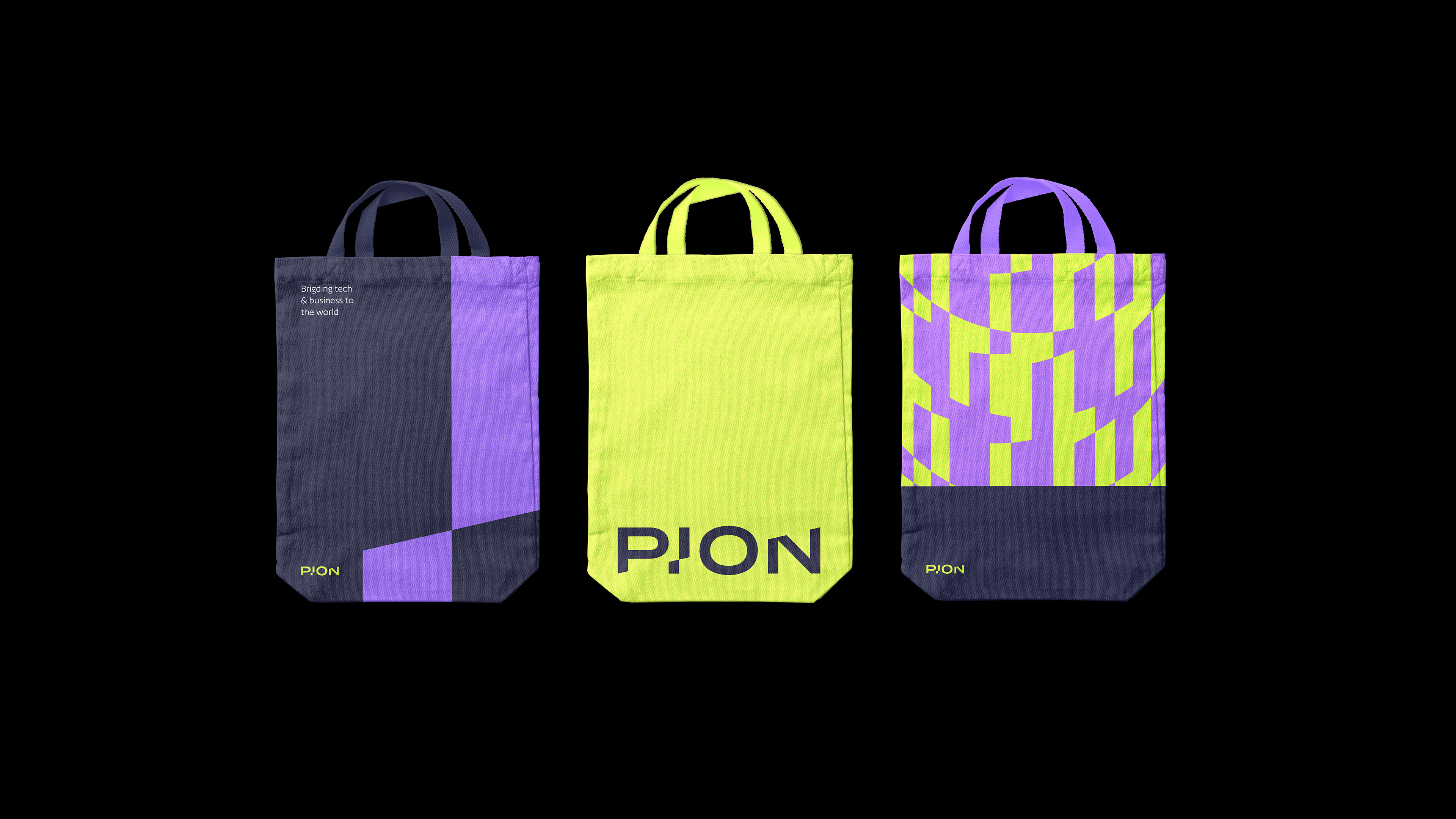
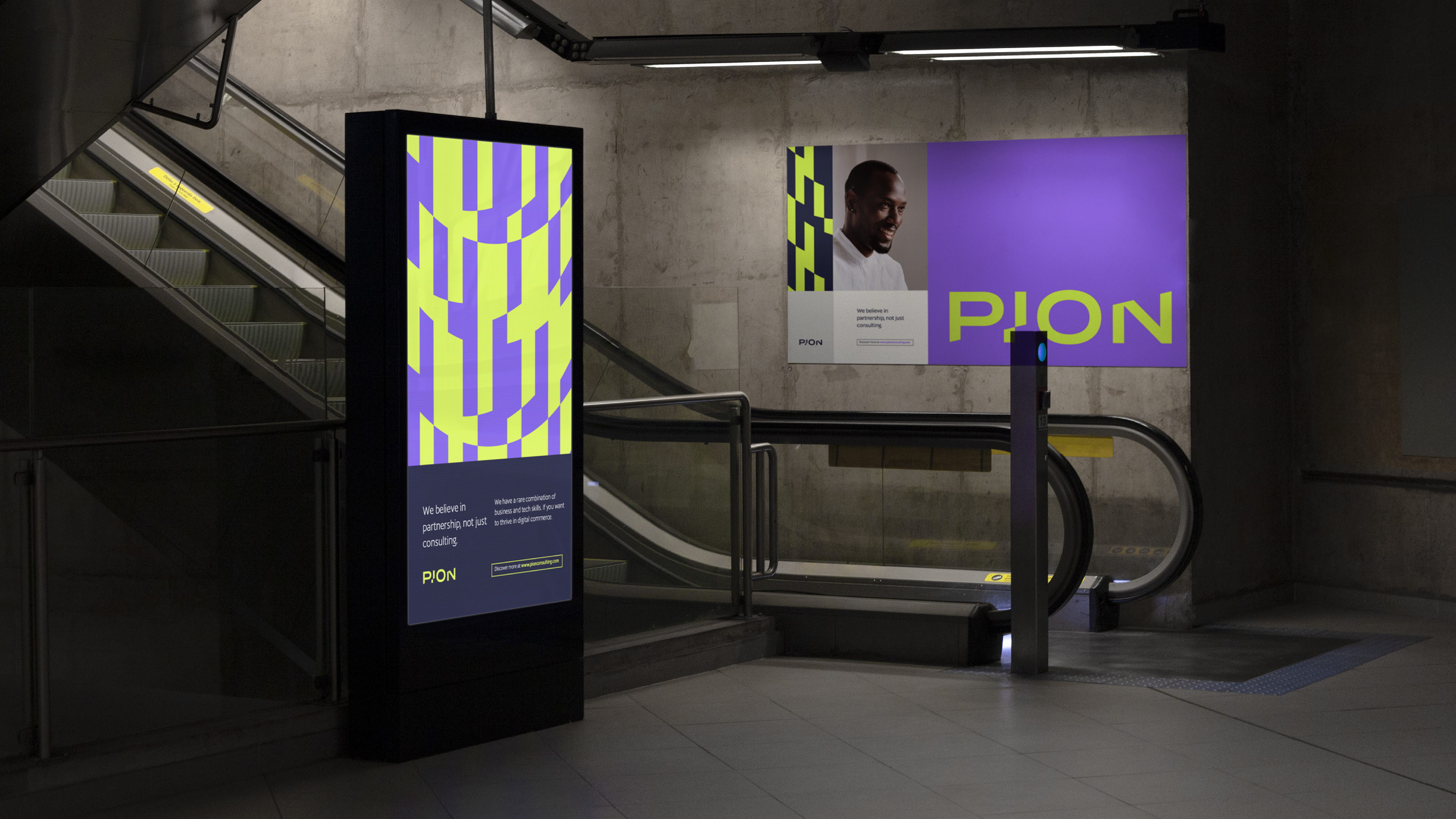
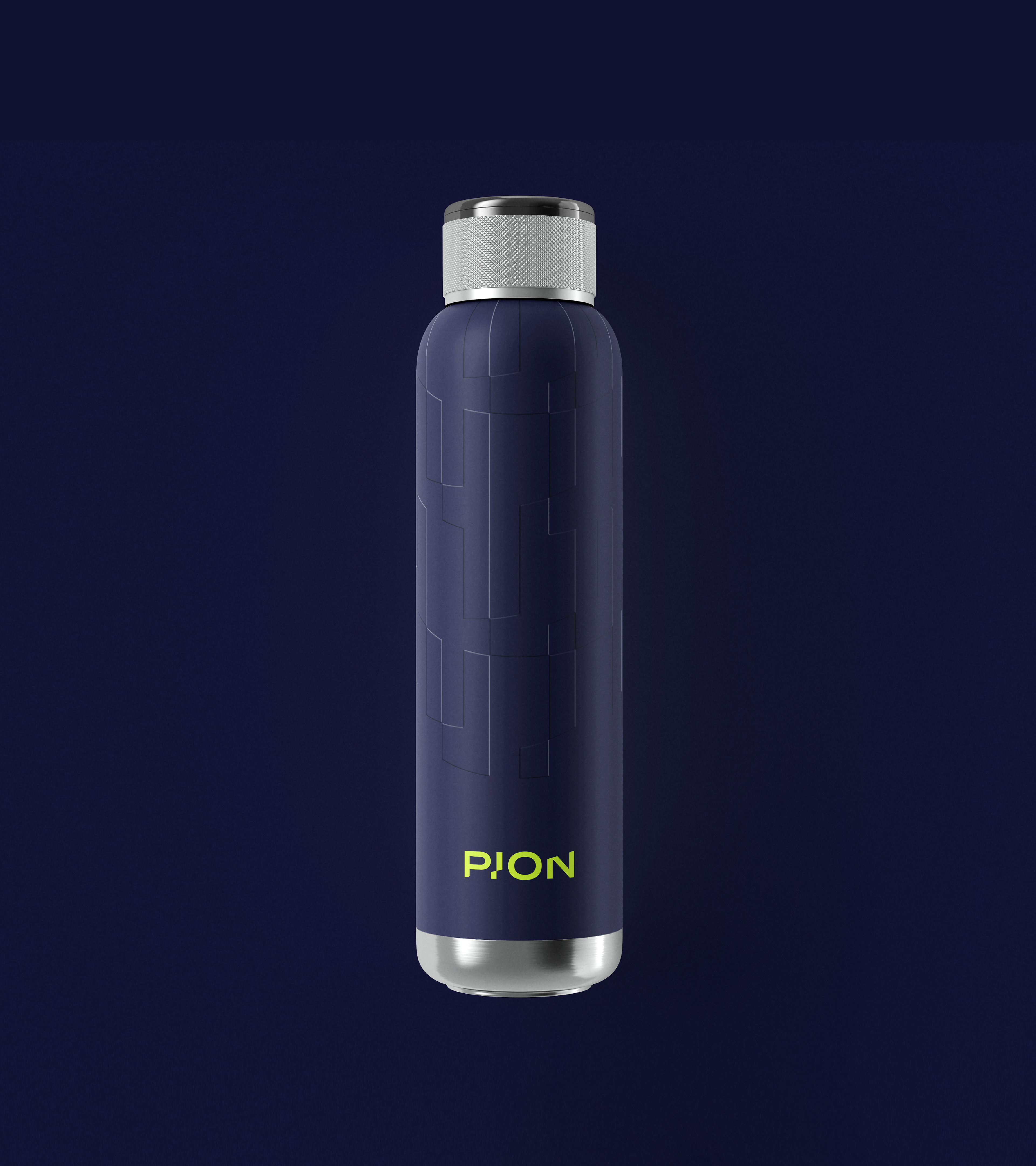
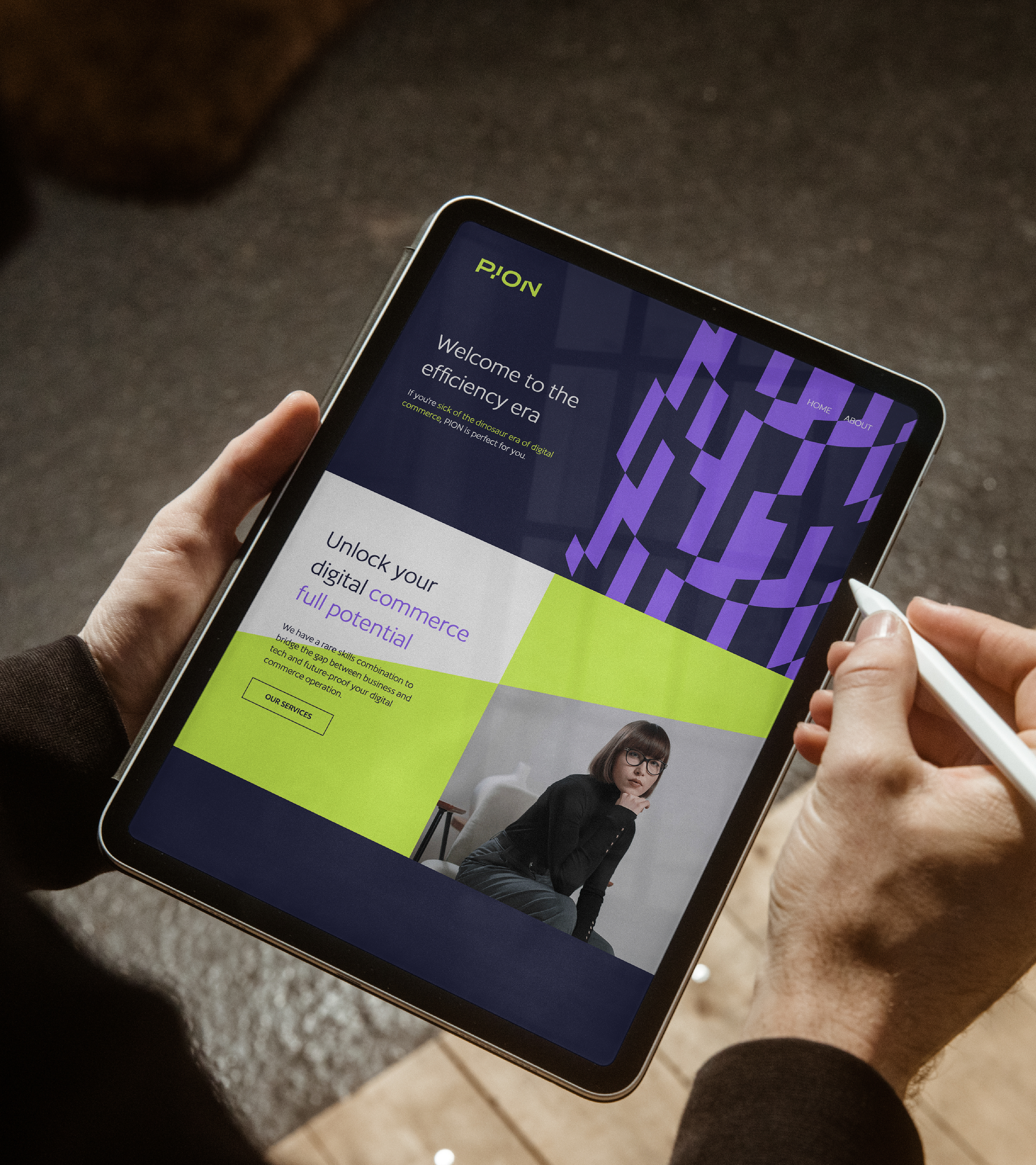
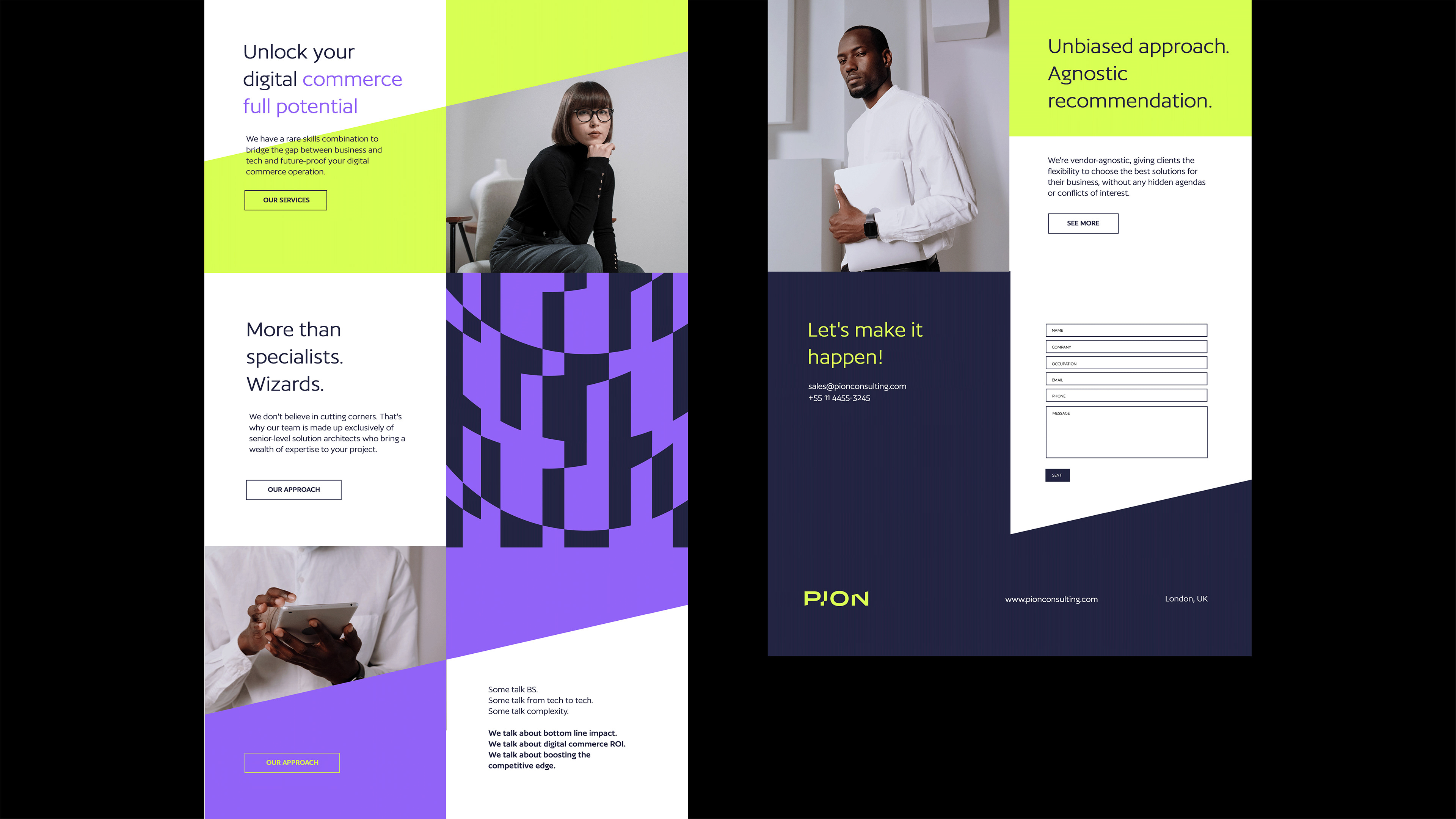
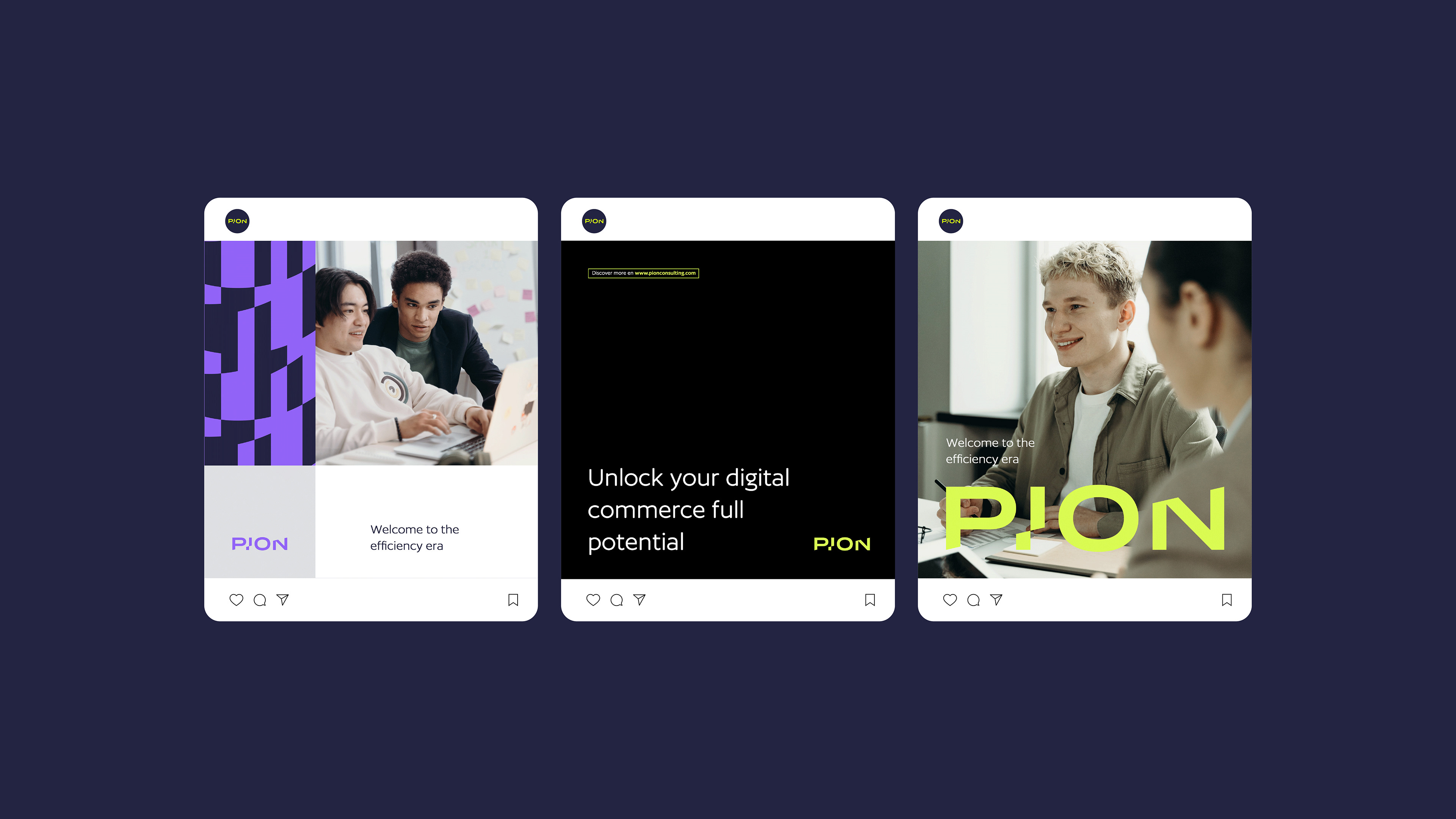
Através da desk research, foi possível encontrar marcas com assinaturas visuais similares e pouco personalizadas, possibilitando para a PION explorar um universo mais bold e interessante. Assim, o logotipo da PION foi construído com uma linha horizontal invisível que corta a marca em sentido crescente com impulso da esquerda para a direita. Além da assinatura marcante, a identidade ainda carrega cores pouco usuais para o segmento, porém de forma profissional e personalizada, e grafismos únicos em formatos de movimento atrelados a um layout moderno, clean, bold e minimalista.
Through desk research, it was possible to find brands with similar and less personalized visual signatures, allowing PION to explore a bolder and more interesting universe. Thus, the PION logo was built with an invisible horizontal line that cuts the brand in a crescent direction with impulse from left to right. In addition to the striking signature, the identity still carries unusual colors for the segment, but in a professional and personalized way, and unique graphics in movement formats linked to a modern, clean, bold and minimalist layout.

Ficha técnica
Agência / Agency: Observe Branding (observebranding.com)
Direção Geral / Direction: Gustavo Arbulu
Estratégia / Strategy: Isa Ribeiro
Identidade Verbal / Verbal Identity: Isa Ribeiro
Identidade Visual / Visual Identity: Lucas Barreira
Obrigado! Thanks for watching!
Follow me on Instagram @lucasbarreira.design
E: falecomlucasbarreira@gmail.com